Why Packaging Matters in Vietnam’s Toothpaste Market
Vietnam’s oral care market has grown into a highly competitive FMCG category, driven by rising incomes, urbanization and stronger awareness of dental health. Toothpaste is the core of this category and holds the largest share of oral care spending in Vietnam.
On supermarket shelves and e-commerce platforms, a few big names dominate: Unilever’s P/S and Closeup, and Colgate-Palmolive’s Colgate. In such a concentrated market, packaging has become a critical tool to:
-
Stand out on crowded shelves
-
Communicate benefits in a split second
-
Signal “local familiarity” or “global professionalism”
-
Support premium pricing and new sub-lines
This article looks at how Vietnamese toothpaste brands design their packaging—from visual elements and consumer segmentation to cultural cues, sustainability, and the way brands work with manufacturers.
Overview of Leading Toothpaste Brands in Vietnam
P/S – The Local Hero with Mass Reach
P/S started as a domestic brand and is now part of Unilever’s portfolio, with deep penetration in both urban and rural areas.
Key characteristics:
-
Positioning: Family-oriented protection and everyday oral health
-
Portfolio: Multi-benefit “123” lines, anti-cavity variants, herbal versions (green tea, bamboo charcoal, salt, baking soda) and dedicated children’s SKUs.
-
Packaging vibe: Trustworthy and practical, often using blue/white for “protection” and green for “herbal / natural”.
Closeup – Youthful, Fresh, and Image-Driven
Closeup, also under Unilever, positions itself around fresh breath and confidence in social/romantic situations, especially for younger consumers.
-
Key themes: Whitening, cooling, “3X brighter” or similar benefit claims.
-
Packaging vibe: High-contrast visuals, dynamic photography, glowing effects and bright colors (often reds, blues, greens) that suggest intensity and modernity.
Colgate – Global Professionalism
Colgate-Palmolive entered Vietnam in the 1990s and remains one of the two biggest oral care players alongside Unilever.
-
Positioning: International, professional, cavity protection and whitening.
-
Packaging vibe: Consistent with global Colgate identity—strong red blocks, clean white typography, and clinical cues. This instantly communicates “global brand” and reliability.
Understanding these three brands helps explain why Vietnamese toothpaste packaging looks the way it does: a mix of local familiarity, herbal storytelling and global, clinical aesthetics.
Key Visual Elements in Vietnamese Toothpaste Packaging
1. Brand Logo and Information Hierarchy
On Vietnamese shelves, logo visibility is non-negotiable:
-
P/S, Colgate, Closeup and other brands place logos in a large, bold area (often top-left or center) so shoppers can recognize them quickly from a distance.
-
The brand name is the first visual layer, followed by 2–3 key benefits (e.g., “Total Protection”, “Whitening”, “Fresh Breath”) and then secondary details like sub-ingredients.
This hierarchy matches the fast-paced reality of Vietnamese supermarkets and traditional shops where shoppers often grab familiar logos without reading much text.
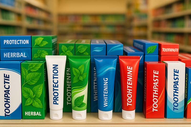
2. Color Palettes and Their Meanings
Color choices are strongly tied to benefit positioning:
-
Blue + White:
-
Signals cavity protection, cleanliness and everyday family use.
-
Widely used on P/S multi-benefit lines and some Colgate variants to convey trust and hygiene.
-
-
Green:
-
Used for herbal, salt, green-tea or natural ingredient variants that tap into consumers’ preference for safe, nature-based formulas.
-
-
Red:
-
Strongly associated with Colgate’s global identity, but also used by other brands when they want to stand out and highlight “powerful” or “intense” performance.
-
-
Black / Charcoal Tones:
-
Used for activated charcoal lines to show “deep cleaning” or “detox”. P/S and Closeup have variants emphasizing charcoal or mineral ingredients.
-
Vietnamese shoppers have become used to this color–benefit coding, so new brands entering the market often follow these conventions rather than reinvent them.
3. Imagery and Icons
Common visual motifs on Vietnamese toothpaste packaging include:
-
Teeth and smiles – A white, shiny tooth or smiling mouth communicates whitening and confidence.
-
Herbal imagery – Green tea leaves, salt crystals, charcoal pieces, mint leaves and other “natural” symbols highlight ingredient stories.
-
Water splashes, sparkles and light rays – Used to dramatize “freshness”, “cooling” and “3X whitening” claims.
-
Numeric icons – “1-2-3” or “12 benefits” icons packaged inside circles or shields for multi-benefit offerings.
All of these visuals are designed to be understandable even at a quick glance and to work well in tiny online product thumbnails.
4. Typography and Language
Typography must balance local comprehension and international credibility:
-
Main text: Usually in Vietnamese, clearly stating benefits like ngừa sâu răng (cavity prevention), trắng sáng (whitening), hơi thở thơm mát (fresh breath).
-
Secondary text: International brands often keep English sub-lines or technology names (“White Now”, “Total Care”) to add a global feel.
-
Style:
-
Bold, sans-serif fonts for claims and benefits (modern, easy to read).
-
Softer, more rounded fonts for children’s products.
-
How Packaging Segments Vietnamese Consumers
1. Age Segmentation
Children’s Toothpaste
-
Uses cartoon characters, fruits, animals or friendly icons.
-
Bright, saturated colors (pink, orange, yellow, light blue).
-
Clear age markings like “2–6 years old”, and flavor illustrations (strawberry, orange) to reassure parents and attract kids.
Adult Toothpaste
-
Relies more on professional and clean designs with whites, blues, greens and metallic accents.
-
Messaging focuses on protection, sensitivity relief, whitening, herbal trust rather than flavor fun.
2. Benefit Segmentation
Vietnamese brands typically build product lines around distinct benefits, each with stable visuals so shoppers can quickly find “their” variant:
-
Multi-benefit / “Total care” lines – Broad claims for families; often blue/white with icons showing multiple shields or ticks.
-
Whitening – Brighter whites, sparkles, lens-flare effects, sometimes silver or gold accents. Closeup and Colgate both run strong whitening narratives.
-
Herbal / natural – Dominantly green, sometimes kraft-paper textures or leaf patterns. P/S and Closeup offer seaweed, salt, mineral and plant-extract formulas that are emphasized on pack.
-
Fresh breath / cooling – Ice cubes, menthol crystals, water splashes, a cool color palette. Closeup’s Vietnamese range heavily uses this cooling imagery.
3. Channel Segmentation
Modern trade (supermarkets, hypermarkets)
-
Prioritizes strong shelf impact, consistent facings and easy variant differentiation.
-
Packaging often includes promo call-outs (e.g., “family pack”, “2+1 free”) as stickers or printed flashes.
Traditional trade (mom-and-pop shops)
-
Smaller shelves and cramped space mean that logo and color matter even more.
-
Outer cartons might carry visible price points to make it easier for shopkeepers and price-conscious shoppers.
E-commerce
-
Packs must still look good when reduced to tiny thumbnail images, so Vietnamese brands tend to:
-
Keep the front panel simple and uncluttered.
-
Ensure the brand name and 1 key benefit remain readable at small sizes.
-
Cultural and Regulatory Factors Shaping Packaging
Cultural Preferences
Vietnamese consumers increasingly look for “natural” and “safe” oral care products. Trends include:
-
Growing demand for products with seaweed, salt, herbal extracts and other “nature-based” ingredients.
-
Preference for brands that emphasize family protection and children’s oral health—which is why many packs show family icons or highlight “for kids/for family”.
As a result, packaging often balances clinical efficacy with natural, family-friendly storytelling.
Regulatory Requirements
To be sold in Vietnam, toothpaste packaging must comply with local regulations covering:
-
Clear display of product name, net weight, manufacturer or importer details and country of origin
-
Batch number and expiry date
-
Approved ingredient list and usage instructions, typically in Vietnamese
-
Appropriate classification under cosmetics regulations and alignment with ASEAN Cosmetic Directive standards for formula/labeling
International brands often add English or other language text for export or tourists, but Vietnamese remains the primary language on pack.
Sustainability and Material Choices
The Vietnamese market is gradually paying more attention to green packaging, influenced by global sustainability commitments and younger consumers’ expectations.
Key shifts include:
-
From aluminum to plastic laminate tubes
-
Earlier, P/S and other brands used aluminum tubes. Packaging later shifted toward plastic/laminate tubes, partly for better print quality and more attractive designs.
-
-
Lighter cartons and recyclable materials
-
Major FMCG companies are exploring carton weight reduction, recycled content and designs that reduce ink coverage while keeping strong shelf appeal.
-
-
Green cues on pack
-
Even when packaging isn’t fully recyclable, “green” visuals (leaf symbols, recycling icons, eco-benefit call-outs) are increasingly used to reassure consumers—especially Gen Z and young families.
-
For brands planning to enter Vietnam, partnering with a manufacturer familiar with eco-friendlier tube structures, FSC-certified cartons and conforming ink systems can be a competitive advantage.
How Vietnamese Brands Typically Work with Manufacturers on Packaging
Although each company has its own process, a common design workflow looks like this:
1. Market and Shelf Research
-
Analyze local shelves and online listings: note the colors, logos, claim styles and price tiers of P/S, Colgate, Closeup and others.
-
Identify gaps—for example “premium herbal whitening” or “sensitive family care at mid-price”.
2. Positioning and Product Line Definition
-
Decide the main promise of each SKU (whitening, herbal, multi-care, sensitive, kids).
-
Choose a price band and target channel (traditional shops vs supermarkets vs online).
3. Concept and Visual System Development
-
Define core brand elements:
-
Logo treatment and minimum size
-
Primary colors and supporting accent colors
-
Iconography style for benefits and ingredients
-
-
Create a system that works across tubes, cartons, multipacks and digital banners.
4. Packaging Engineering and Material Selection
Working with an OEM/ODM or packaging specialist, brands choose:
-
Tube type: plastic laminate, all-plastic or increasingly, more recyclable constructions
-
Cap design: flip-top vs screw cap; shape and grip for ease of use
-
Carton board: thickness, stiffness and surface (matte or gloss)
-
Print methods: number of colors, metallic inks, foiling, embossing, spot UV etc.
At this stage, manufacturers also flag what is technically feasible and help optimize the design for print and cost.
5. Prototyping and Consumer Feedback
-
Produce mock-ups or sample tubes/cartons for internal review and, sometimes, small consumer tests.
-
Check for issues: small fonts, low contrast, misleading icons or claims that could raise regulatory concerns.
6. Final Artwork and Mass Production
-
Lock in dielines, print-ready artwork and color standards (Pantone / CMYK references).
-
Align production schedule, QC checks and carton coding (batch, expiry).
-
For export, ensure multi-language layouts are correct and compliant.
An experienced personal care manufacturer can support not only filling and packing but also:
-
Recommending pack sizes tuned to Vietnamese affordability and shelf norms
-
Advising on ink and board choices for local climate and logistics
-
Helping align claims and symbols with local expectations and regulations
Practical Tips for Brands Entering the Vietnamese Toothpaste Market
If you’re planning to launch toothpaste in Vietnam or design private-label packaging for Vietnamese customers, consider these practical points:
-
Study the big three first:
Spend time with P/S, Closeup and Colgate in both supermarkets and online stores. Note how each brand uses color, icons and claims. -
Build two visual routes:
-
One “local & herbal” route: green-forward, ingredient imagery, family orientation.
-
One “professional & whitening” route: clinical whites, blues, or reds with strong whitening and enamel-protection cues.
-
-
Limit front-of-pack claims to 2–3 strong points:
Vietnamese consumers browse quickly. Too many messages can reduce clarity and trust. -
Design for thumbnails, not just shelves:
Check how your packaging looks at small sizes on mobile screens; logo and main benefit must be readable. -
Align with manufacturing reality early:
Involve your manufacturer when you first sketch concepts to avoid designs that cannot be printed, finished or assembled within your budget. -
Make “natural” credible, not just decorative:
If you use herbal or mineral imagery, ensure the formula genuinely contains those ingredients and that claims comply with local cosmetic regulation.
Conclusion
Vietnam’s toothpaste packaging design is shaped by a duel between global and local champions in a fast-growing market. P/S and Closeup bring strong family and youth positioning with localized flavors and herbal stories; Colgate brings global professional credibility.
Across brands, you see a common logic:
-
Bold logos and clear hierarchies for instant recognition
-
Color systems that signal benefits like whitening, protection and herbal care
-
Icons and imagery that work in both physical stores and e-commerce thumbnails
-
A growing attention to sustainability and green cues in packaging materials and design.
For any brand—or OEM/ODM supplier—eyeing Vietnam, understanding these design patterns is the first step. The next is to blend local relevance, regulatory compliance and manufacturing feasibility into packaging that not only looks attractive but also wins long-term consumer trust.
FAQ
Q1: What colors are most popular in Vietnamese toothpaste packaging?
Blue and white dominate for everyday protection lines, green is common for herbal/natural variants, and red is strongly associated with Colgate’s global identity and high impact on shelf.
Q2: How important are herbal ingredients in Vietnamese toothpaste design?
Very important. Brands increasingly highlight seaweed, salt, herbal extracts and natural minerals on pack to signal safety and local familiarity, reflecting consumer interest in nature-based products.
Q3: Do Vietnamese consumers respond better to global or local design styles?
Both matter. Global design cues (clinical red and white, professional imagery) signal quality and technology, while local herbal and family-oriented visuals create emotional trust and cultural relevance. Successful brands often mix the two.
Q4: Is sustainability already a big factor in toothpaste packaging in Vietnam?
It’s emerging rather than dominant. Major players are exploring greener materials and lighter packaging, and younger consumers are more sensitive to green cues and eco-messaging.
Q5: What role do manufacturers play in Vietnamese toothpaste packaging design?
Manufacturers help translate creative concepts into printable, compliant and cost-effective packs: optimizing tube structures, carton specs, print processes and ensuring labels meet local regulations and export requirements.